How to Build & Write Ecommerce Product Pages for Maximum Traffic & Conversions.
How you present the products is crucial for a successful ecommerce website. Look at the big name ecommerce websites such as iHerb.com, Amazon.com, Crutchfield.com, GAP.com, JohnLewis.com, FatFace.com, etc, for ideas. See how their product information is laid out on the page in ways that are structured and presented with clarity so you can find items quickly and intuitively.
Elements of a Successful Product Layout Template:
- Product name in bold type using product keywords: this generates an H1 tag for SEO – more on this in 8) below
- Short Description placed underneath the Product Name: this has a H2 tag
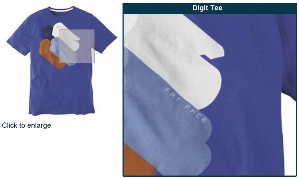
- Image to the left of the center container with the ability to ‘View Larger Image’, to view more related images (thumbnails will sit underneath main image), or an option to magnify any area of main image
- Use alt text on images
- Add to Cart/Basket box (or cart elements) to right of image: RRP, Your Price, % Saving, Quantity, ize, Color Options, Warranty, Availability, Add to Cart Button, etc
- Position the product description underneath the main image and Add to Cart box. Separate with heading from feature list. Utilize supplementary images to enhance the description
- Bulleted feature list positioned underneath the main product description
- Any further information below such as technical or related information
- Detail any shipping, print this page, warranty, email a friend, social bookmarks, supplementary but essential info either below the images and above the description or below the description box (as long as the page is not so long that they get lost).
Attributes.
You will need to decide how many products you will be selling, the way they are laid out on the page, and what fields, attributes and options you will need per product. Attributes such as size, color and quantity all need to be factored in and positioned accordingly.
Images.
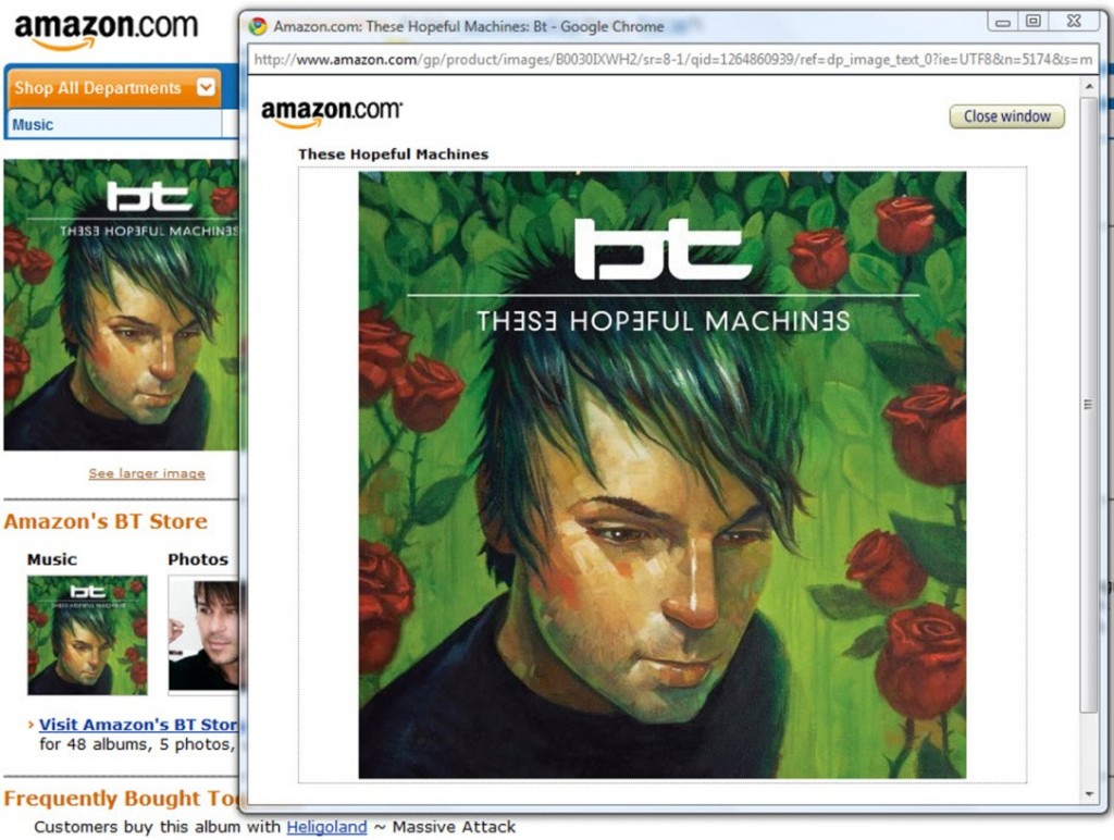
Include the basics like web-ready and compressed images so they load fast. Use high quality images for the main image, thumbnails (the small image preview) or additional images, and for the ‘view larger image’ option.
Main Image with Thumbnail Preview Images
View Larger Image with Clear ‘Close Window’ Link
Magnify (Zoom) Image Example
Tabbed Layout.
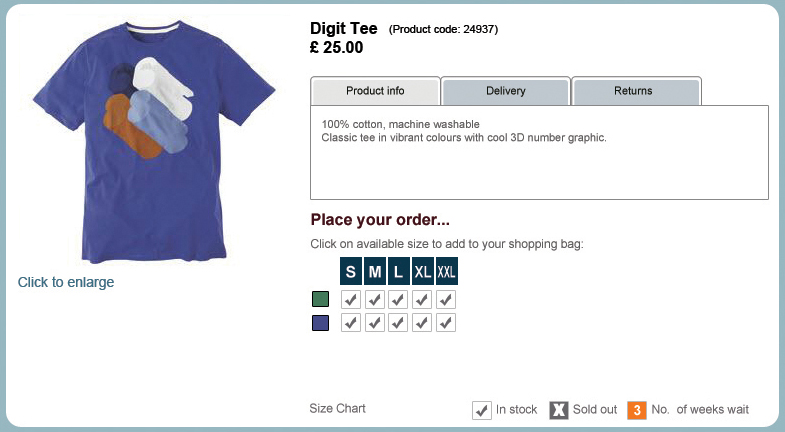
A good option is to have the description, features, and shipping information in tabbed boxes in the same page location as the main description. This keeps the page short and compact. This just depends on your SEO aspirations and desired page layout.
- See www.fatface.com for an example of this tabbed product layout (image below)
- Or checkout www.crutchfield.com who are great at tabbed layouts
Product Descriptions.
Use a benefit-oriented headline to capture the attention of your visitor when they arrive on your page. They may get to this page directly from Google. A H2 tag on this headline always helps for SEO. Use well-written descriptions promoting benefits and then list features using bullet points, in this order. If a customer can say ‘So What?’ to your description copy then introduce more benefits and remove features from this section, dropping them into the bullet point feature list below. Add video where required as this enables the buyer to use more of their five senses to make a positive buying decision.
Long Copy vs. Short Copy.
There is a debate in marketing circles: do you write short copy or long copy? Ecommerce and direct response are two very different animals in my opinion, but you can use direct response elements on an ecommerce website. However, this has to work in synergy without cheapening the positioning, and that is the big challenge.
People who succumb to out and out direct response are generally vulnerable and somewhat naive, which is why some Internet Marketing Gurus and Get Rich Quick businesses make a bundle of cash—because they manipulate as opposed to persuade—through their words targeting gullible people.
Ecommerce customers are a different breed in many respects. They will actually be looking for your products, so the use of direct response needs to be subtle and woven in with your typical ecommerce layout.
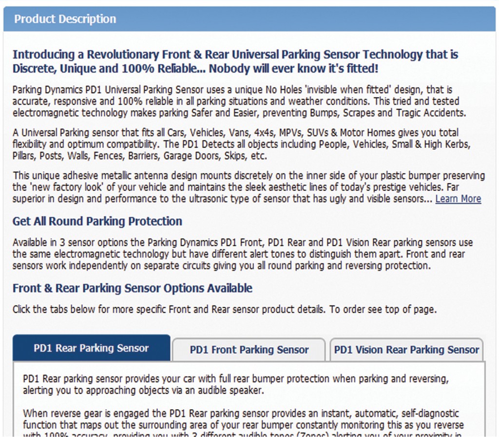
Example of Captive Headline (H1 Tag) and Long Description loaded with Keywords and Key Phrases
Product Pages Resource Information.
It’s a good idea to display and link to key information your prospects or customers may need to make a buying decision. Not answering their required questions and your customers could leave them frustrated. They might then either leave your website or leave your product page looking for specific answers—and never return.
Possible Resource Items or Links to These Items:
- Print Page, Email Page, Bookmark Page
- Shipping Details (Options, Prices, Delivery Times)
- Product Warranties & Money Back Guarantees
- Customer Reviews, Product Comparison.
Add to Cart Box.
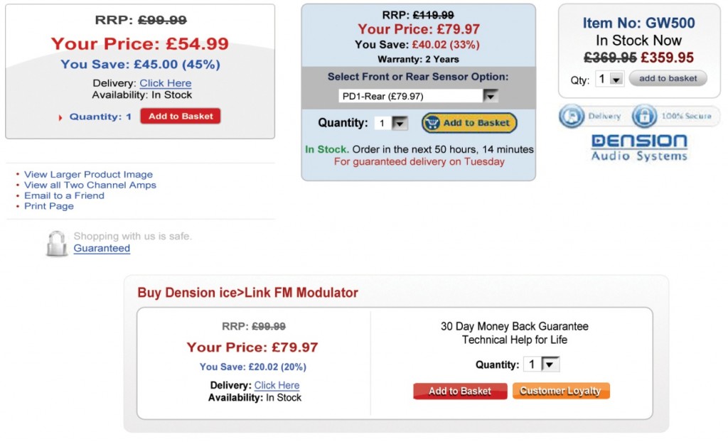
This box or alternatively these elements positioned around your ‘add-to-cart’ button will contain all the essential information required for your prospect to be comfortable enough to add your products to their shopping cart. Items required here are: price, attributes, options, quantity, shipping times, stock availability, brand of product, etc. The best position for this box is to the right of the main product image, because people read from the left. The Add to cart button (or ‘add to basket’ – in the UK), will sit underneath the price and other options because people also read from top to bottom.
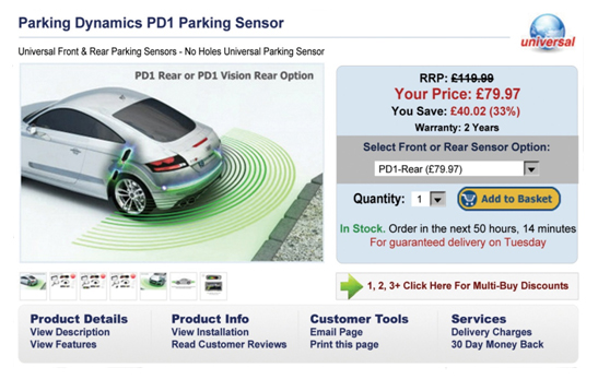
4 Example Add to Cart/Basket Boxes with Key Info in Each
Add to Cart box Elements could Include:
- Clear Prices, including Marked Down Recommended Retail Prices (RRP’s) with % off
- Attributes: Color, Size, Quantity
- Stock Levels & Availability of Product
- Warranty
- Money Back Guarantee
- Security Features and Guarantees
- Discounts for Large or Bulk Orders
- Price Matching Option if You Offer this
- Customer Reviews.
All of the above areas give the customer the appropriate details required to make a buying decision.


